
5 Ways to Use the 2022 Pantone Color of the Year in Your Home
Our Austin Architects Share How to Use the 2022 Pantone Color of the Year in Your Residential Design Plan
Pantone has once again announced their Color of the Year! As we know from past trends, these yearly announcements significantly impact the direction of residential design and architecture. Last year, our Austin architects shared ways to use the 2021 Pantone Color of the Year in your home. So, we decided to once again challenge ourselves with finding creative applications for 2022’s color throughout your design plan. Get ready! This year’s choice is vibrant, bold, and impactful. (Plus, it’s one of our favorite colors yet!)
Pantone Makes a Brand New Color for 2022
In years past, Pantone has selected a color from their extensive roster of hues for the Color of the Year. Last year, they broke tradition by choosing two colors, Illuminating Yellow and Ultimate Gray. However, they are shaking things up once again as Pantone mixed an entirely new shade for the 2022 Color of the Year. This has never been done before!
“The Pantone Color of the Year reflects what is taking place in our global culture,” says Laurie Pressman, vice president of the Pantone Color Institute. As we all know, our vision of the world has dramatically shifted over the past two years. Pantone Color Institute Executive Director Leatrice Eiseman adds, “It was really important for us to come up with a new color because we have a very new vision of the world now.” The 2022 Color of the Year symbolizes the changes the world is experiencing as we move beyond the pandemic's isolation and uncertainty.
Say Hello to Very Peri, Pantone’s 2022 Color of the Year
Meet Pantone’s 2022 Color of the Year, PANTONE 17-3938 Very Peri. Very Peri is a dynamic shade of periwinkle blue with vibrant violet-red undertones. The shades of blues symbolize faithfulness and endurance, while the reds add energy and excitement. Together, this unique mix creates an entirely new color that sparks creativity, courage, and joy. What better way to look to the future than with a color that inspires?
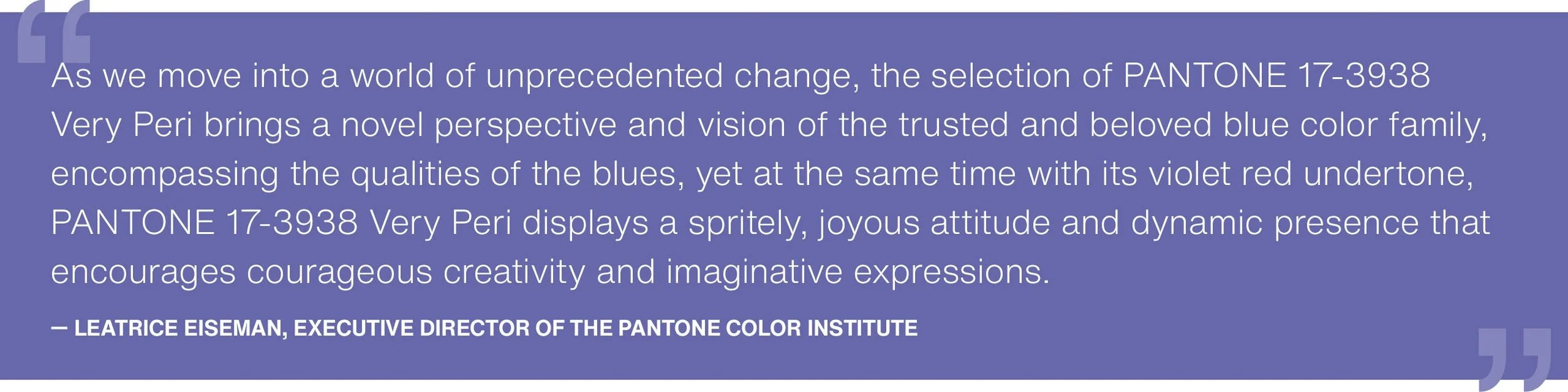
“As we move into a world of unprecedented change, the selection of PANTONE 17-3938 Very Peri brings a novel perspective and vision of the trusted and beloved blue color family,” says Eiseman. “Encompassing the qualities of the blues, yet at the same time possessing a violet-red undertone, PANTONE 17-3938 Very Peri displays a spritely, joyous attitude and dynamic presence that encourages courageous creativity and imaginative expression.” In many ways, Very Peri is more than a color. It is a backdrop to the new landscape of possibilities we face as we collectively decide to rewrite our lives post-pandemic. If you want to reinvent yourself this year, embrace this happy and creative color to back you up on the journey.
5 Ways to Use the 2022 Pantone Color of the Year Throughout Your Home
Here are five ways to use Pantone’s Very Peri throughout your home in 2022.
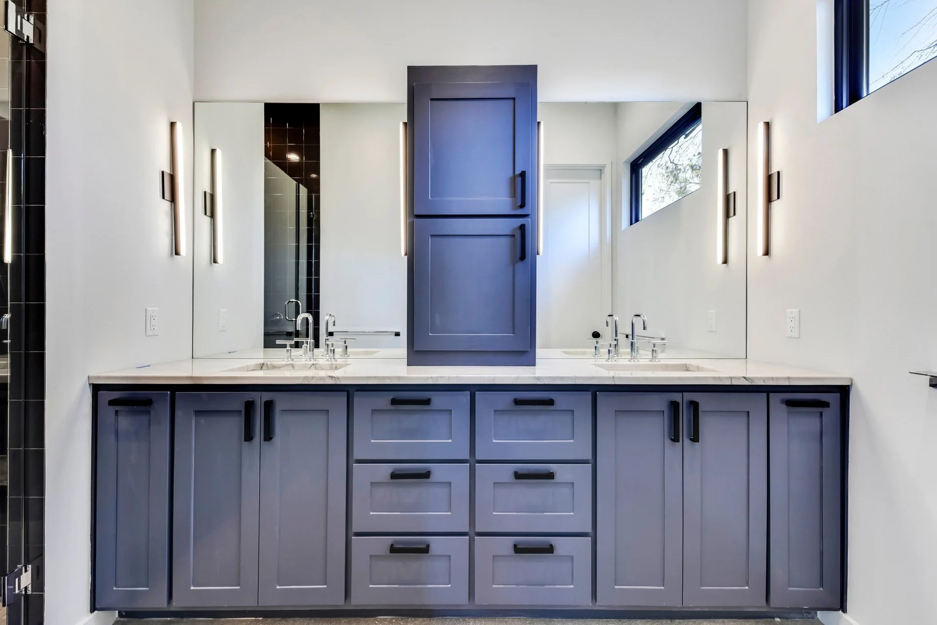
Very Peri Inspired Cabinets by DK Studio
1. Paint a Very Peri Front Door
The front door is the perfect place to try out Pantone’s newest Color of the Year. This vibrant shade of periwinkle blue will draw attention, increase curb appeal, and establish a clear destination for guests entering from the street. Very Peri represents transitions, and the front door is a beautiful transitory moment from the curb to the interior. Remember to choose exterior paint colors for your home carefully. Test the shade on the door first and confirm that it matches the rest of your property's exterior color palette and architectural style.
2. Go Bold with Very Peri Walls
Very Peri symbolizes change, inspiration, and creativity. These qualities are precisely what home gym and home office designs should evoke. Create a dramatic (and inspiring) space with Very Peri walls. Remember, you can go lighter or darker on the shade for a calmer or more dramatic effect.
3. Add a Touch of Fun with Very Peri Accent Colors
If you are hesitant to paint an entire room or home exterior in Very Peri, try adding just a touch of fun with thoughtfully placed color accents. While Pantone’s 2022 Color of the Year is bold, Very Peri is also flexible and seamlessly coordinates with a range of color palettes ranging from lively to muted.
4. Sprinkle a Dash of Very Peri in the Kitchen
Colorful kitchens have been trending since 2020 sent us into banana bread baking frenzies. We are spending more time cooking and eating at home, so it makes sense that we want our kitchens to be a little more fun and vibrant. Very Peri has grounding and invigorating properties, making it an excellent selection for a space that routinely functions as the home's central hub. Our Austin architects recommend adding a dash of Very Peri to your kitchen design by ordering custom colored appliances from Big Chill or painting accent kitchen cabinets for an unexpected surprise.
5. Install Very Peri Accent Tile
If you want to bring the 2022 Color of the Year into the living room, consider installing Very Peri accent tile around your fireplace surround and hearth. With vibrant violet-red undertones, the hue will beautifully complement your roaring fire.
Should You Use the New 2022 Pantone Color in Your Home?
Pantone’s Very Peri is a beautifully dynamic shade of periwinkle blue that sparks feelings of inspiration, creativity, and optimism. Our Austin architects believe it is the perfect hue to incorporate into your residential design plan. (But, we also love all things purple if you couldn’t tell from our logo.) If you are looking to reimagine your home this year, reach out to our team for architectural design assistance. We can’t wait to see what 2022 has in store.